Save the date, this 25th of September is the K4C race day!!
Read MoreRodeo Ellensburg 2016
Pictures and details from the Ellensburg rodeo of 2016, pictures of our roadtrip to Palouse Falls and Leavenworth and a summary of pictures from previou's years of the rodeo.
Read MoreArt with tissue paper with kids
One of the art projects we did this summer is create our own artwork for the new house. We decided to experiment with tissue paper we had from paper wrapping and I got 4 24x24'' canvas from Michael's.
Read MoreWe are what we eat
Making a daily effort to eat well and take care of myself. If it was for me I would eat a plate of pasta (any kind!) and a chocolate bar for every meal. But that can't happen so I made a poster to remind me that we are what we eat. It is so true!
I read an article the other day that said; "Fight aging before you age" and it is stuck in my mind ever since. I am thinking about creating a print and hanging it in my room to be reminded every day. Taking care of my skin, being active and applying sunscreen have become priorities.
Here's a list of some documentaries worth watching available on Netflix.
Disneyland + Santa Barbara + San Francisco
DISNEYLAND + CALIFORNIA ADVENTURE
Disneyland and California Adventure happened a few weeks ago, we got to be kids again, we ran around trying to find the fastest and scariest roller coaster, we got to hang out with goofy, we ate pickled cucumbers with Tajín, chocolate covered bananas and spinned in the tea cups until we were about to throw up.
After a long day walking and running around the happiest place on Earth, that night we met with our dear friends Jade and Felipe, and eventhough we couldn't feel our feet we managed to get a drink before bedtime. We spent the night in LA and the next morning, ate the best burrito and acaí bowl of my entire life and then drove to Santa Barbara to spend the next few days there. The wedding was in Santa Barbara on Sunday but we spent the day before with Jade and Felipe which was a HIGHLIGHT of our trip, what a fun couple!
Santa Barbara is SO beautiful, everything is walking distance apart, amazing restaurants, wineries at every corner and the arquitecture and design is unique.
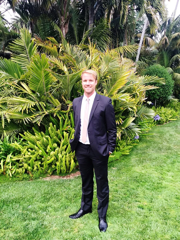
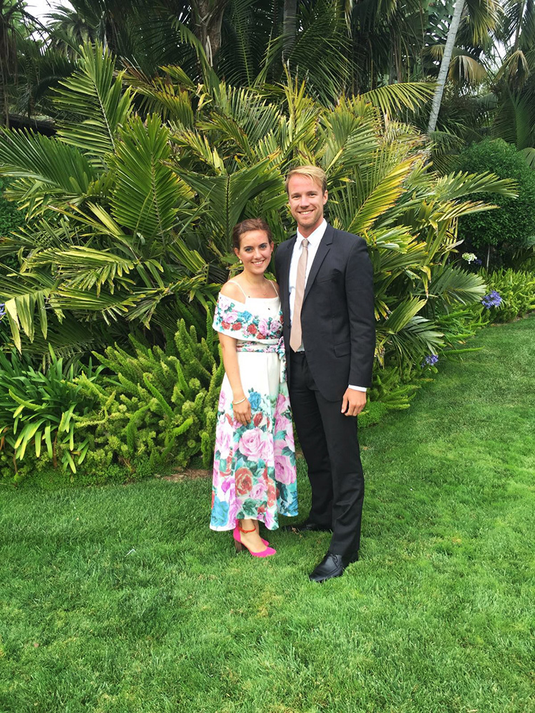
On Sunday it was wedding day, we spent the morning laying on the beach, which I managed to burn the entire back of my legs and that night we celebrated the union of our friends David and Jamie Deming at the beautiful Four Seasons on a beautiful warm night next to the ocean. Ryan and I are so grateful that we got to be part of their love and union along with their friends and family.
And I thought Santa Barbara couldn't be any cuter until I went to its airport. You know a place has a charm if their Airport is cute. I rented a car at the airport, said goodbye to Ryan James and drove for 5 and a half hours to San Francisco to meet with my tita Laura. I had an appointment the next day to renew my passport and what a great way to spend the day with her! ;) San Francisco NEVER dissapoints!
'Small World'
SANTA BARBARA
Outside our Airbnb with Felipe and Jade
#thedemingduet Wedding in Santa Barbara
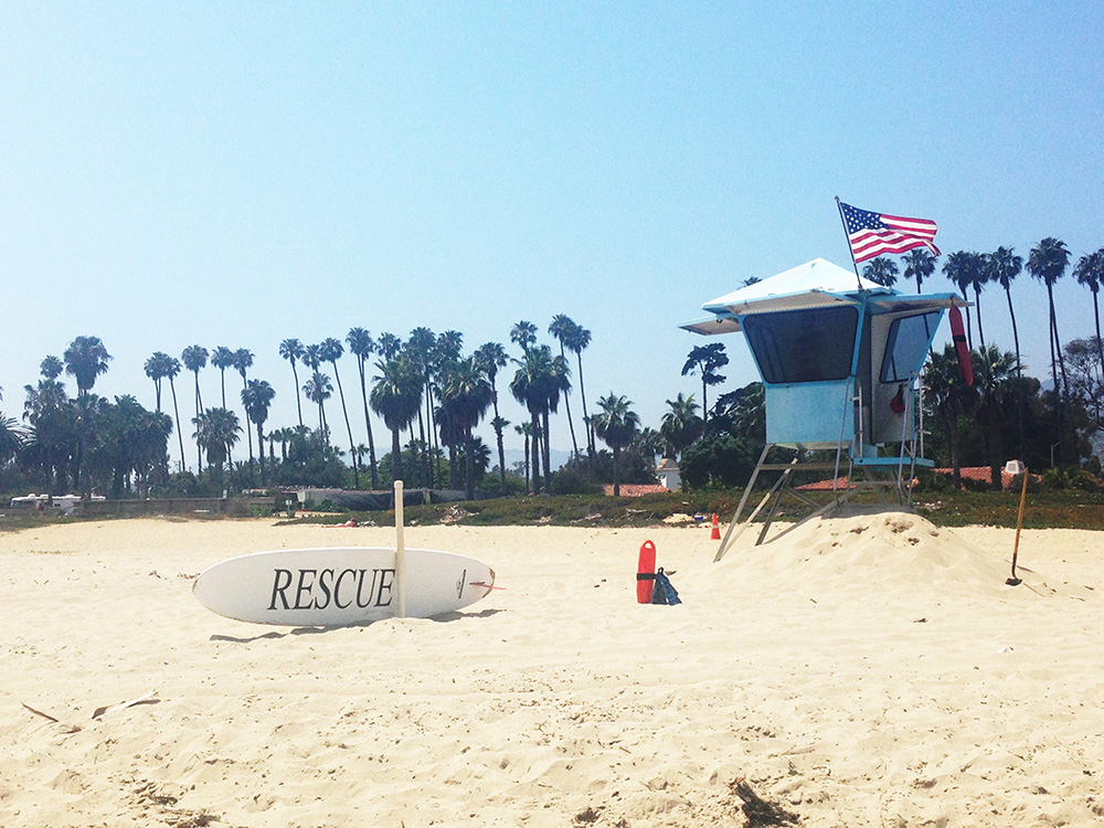
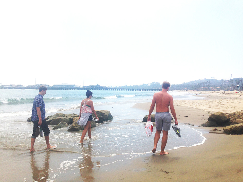
Santa Barbara beach
Santa Barbara beach
SAN FRANCISCO
They gave me the biggest van they could find but driving by myself from Santa Barbara to San Francisco on those beautiful roads was a great experience. I discovered some great songs along the way that you can find at the Life + Sound Summer '16 playlist I created. I made it to San Francisco at around 11pm, and Laura and Robert were waiting for me. The next morning we spent about 3 hours at the Spanish Consul in San Francisco to renew my passport. Afterwards we went back to Laura's apartment, she cooked me the best pasta and then we took a nap, spanish style. When we woke up we walked around San Francisco with her Roxy, had mascarpone and cake and she showed me some of her favorite spots.
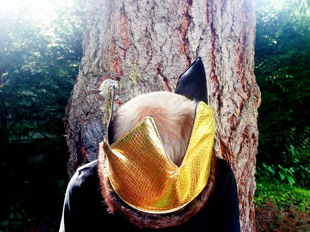
Crown tutorial for Wild + Free
Crown inspired by "Where the Wild Things Are" for Wild + Free
I have the pleasure of collaborating with the beautiful homeschooling community Wild + Free in some of their monthly content bundles.
Wild & Free is mostly an Instagram-based community (@wildandfree.co), but they also host events throughout the year and produce monthly content bundles packed with articles, how-tos, downloads, devotionals and media from inspiring homeschooling mamas from all over the world.
I mostly collaborate in their bundles mainly in their DIY/Craft section of the magazine. Every month the content bundle is inspired on a theme (DAYDREAMS, FATHERS, LIGHT, RAIN, CHERISH, TRAVEL, ADVENTURE) depending on the time of the year they are published and that's what defines the tutorial I am going to create.
This reversible crown tutorial was created for the CAMPFIRE (July) content bundle and was inspired by little Max from “Where the Wild Things are” (Donde Viven los Monstruos).
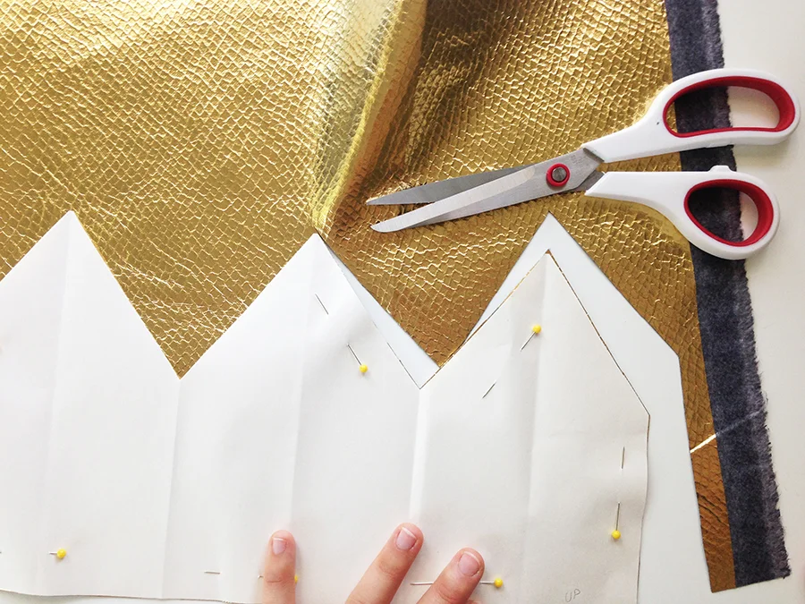
Before I start, I usually don't know how it's going to turn out and neverhave made the product before, so I usually look for inspiration on the web and then go resource for the materials. Then I find a pattern that fits what I'm trying to design and make changes to the design pattern to fit the concept I have in mind or I draft the pattern myself and work with trial and error to find the final product and I create one sample. I repeat the process from the beginning and take a picture of each step on a white background.
Snippets of the step by step:
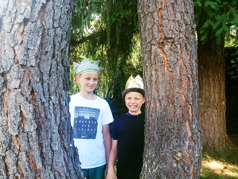
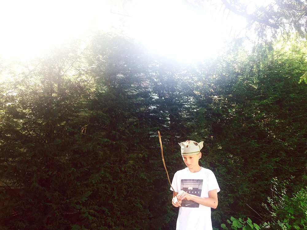
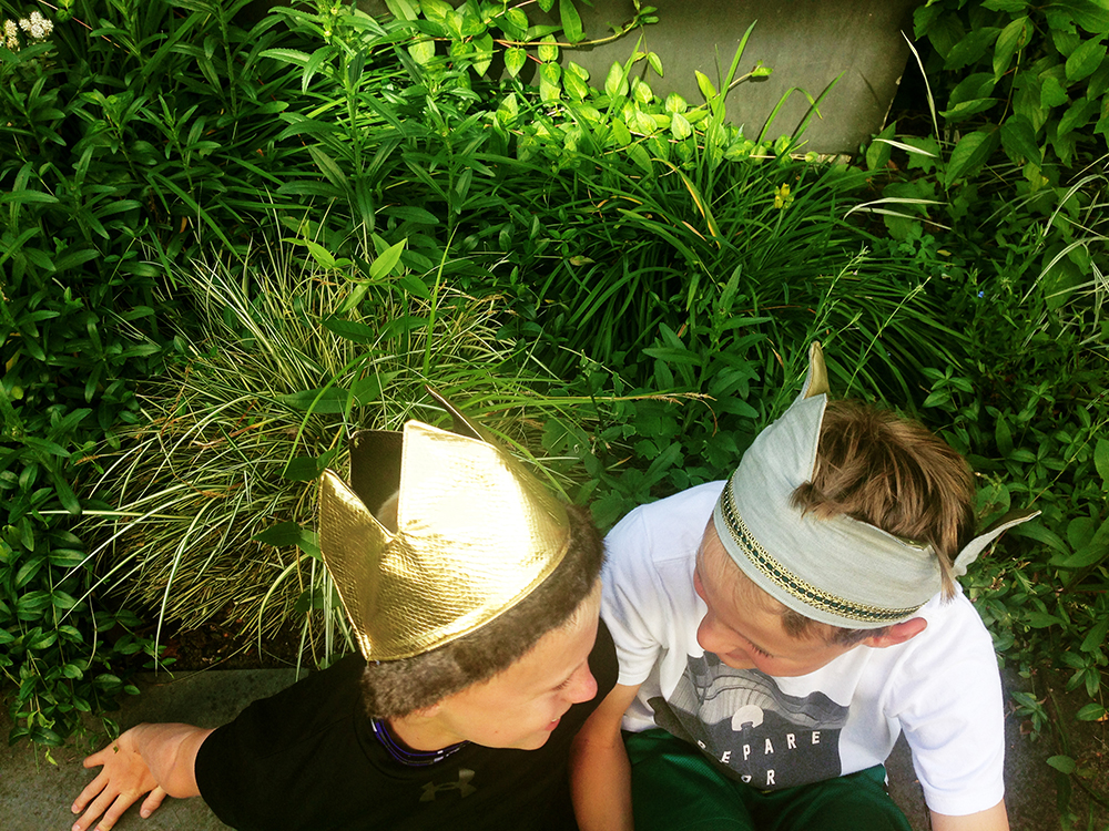
My sweet boys helped me out styling the crowns, they were naturals and represented exactly what I wanted. For the past tutorials, I used girls as my models, since my products were a little more feminine, but this time I wanted to feature boys wearing the crown, even though this can be used by girls too! I just wish they would keep it always on ;).
I just want to thank Lucas and Colin for inspiring me daily, for being the highlight of my days, for making me laugh, for your love for my cinnamon toasts and for these last 4++ years of awesome fun and for teaching me how to be Wild + Free. Coming to your family four years ago has been one of the best decisions I've ever made.
Girona Temps de Flors 2011
Life + Sound: Summer '16
Playlist Life&Sound Summer 2016
Oh hey summer! 👋🏽, you came too fast and are also going by too fast for my liking. I'm enjoying you though, I noticed your flowers and gardens are exploding way more than last year, and our birds seem to sing louder too.
Read MoreMural al Fresco
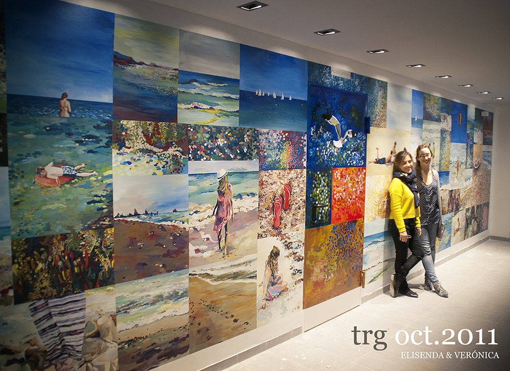
Mural painting 8m x 3m in Tarragona.
Photo Credit: Javier Gargallo
I can't believe I've never talked about this PROJECT (yes, with caps) that Veronica Algaba and I did about 5 years ago! I think I finished so exhausted and drained by it that I didn't even want to talk about it. Now I only remember the beautiful results and how much Veronica and I grew from it, but let me say it was one of the hardest things I've even had to work on. It took me about a year to get back to painting. It is now, 5 years later that I look back at this masterpiece we did together and how much it streched us and made us grow as artists. I don't think I will ever do something like this, but I look back proud of what we accomplished, the hard work we put into it, specially having to work in a dirty and humid basement for an entire month.
We finished right on time for me to fly to the US to start a new year adventure as an Aupair. And I want to thank my dear Laura Garcia Cachinero for making my suitcase for a year, I would still be there if it wasn't for her.
It was an intense month, the wall seemed bigger every day, no matter how many hours we would spend in that basement, the work left seemed to never end. We cried, we laughed, we singed, and there were times where we wanted to quit. And I want to thank our parents for their support, for their homemade meals, their snacks and drinks, for their car rides and their multiple trips to the paint store.
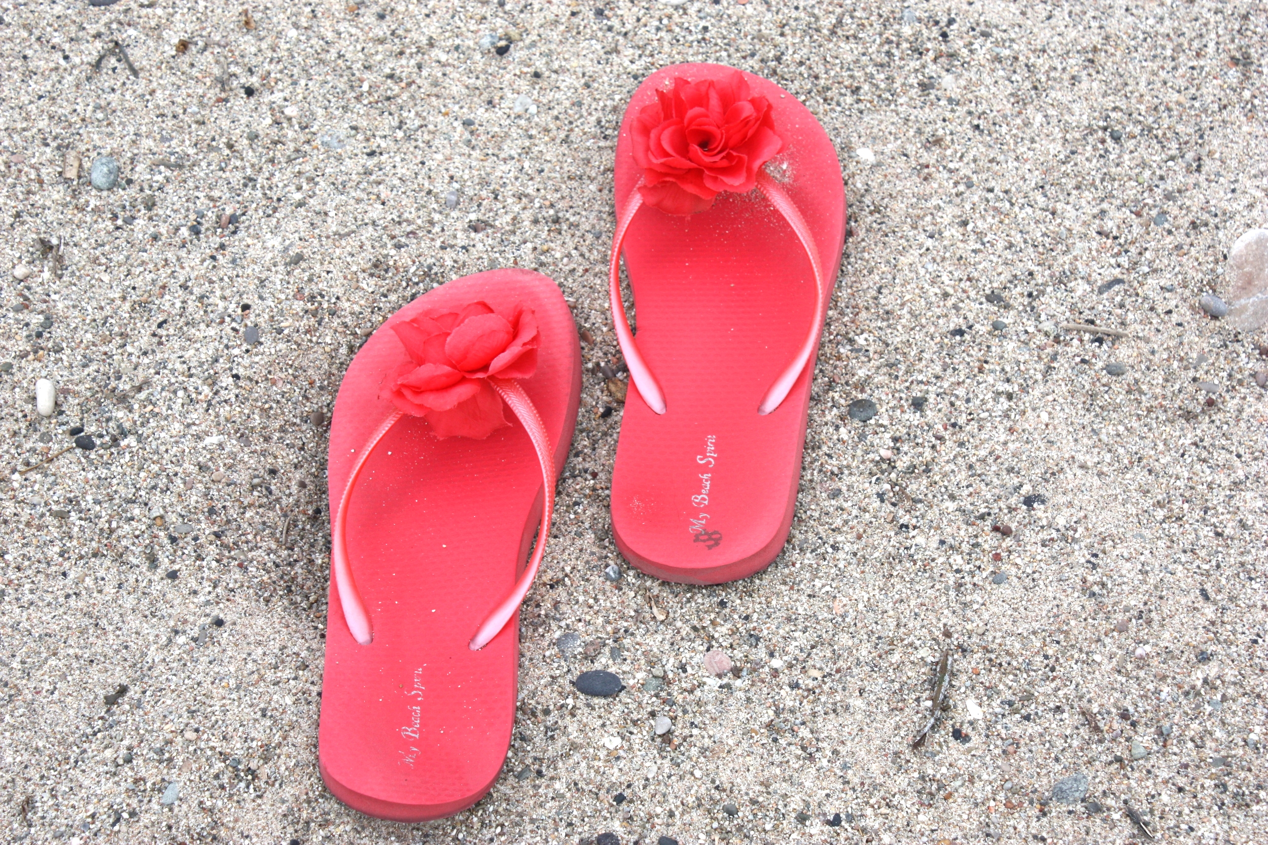
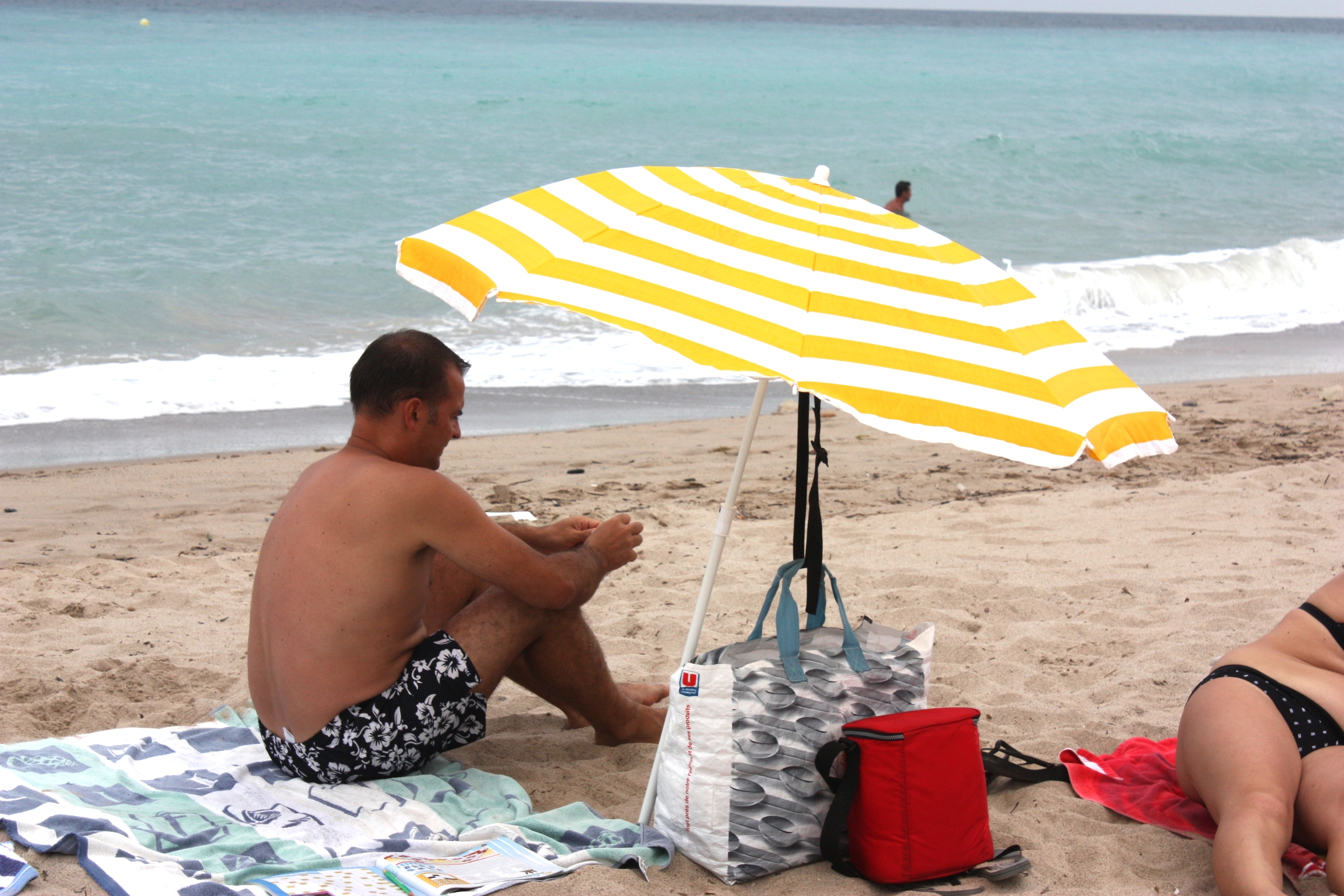
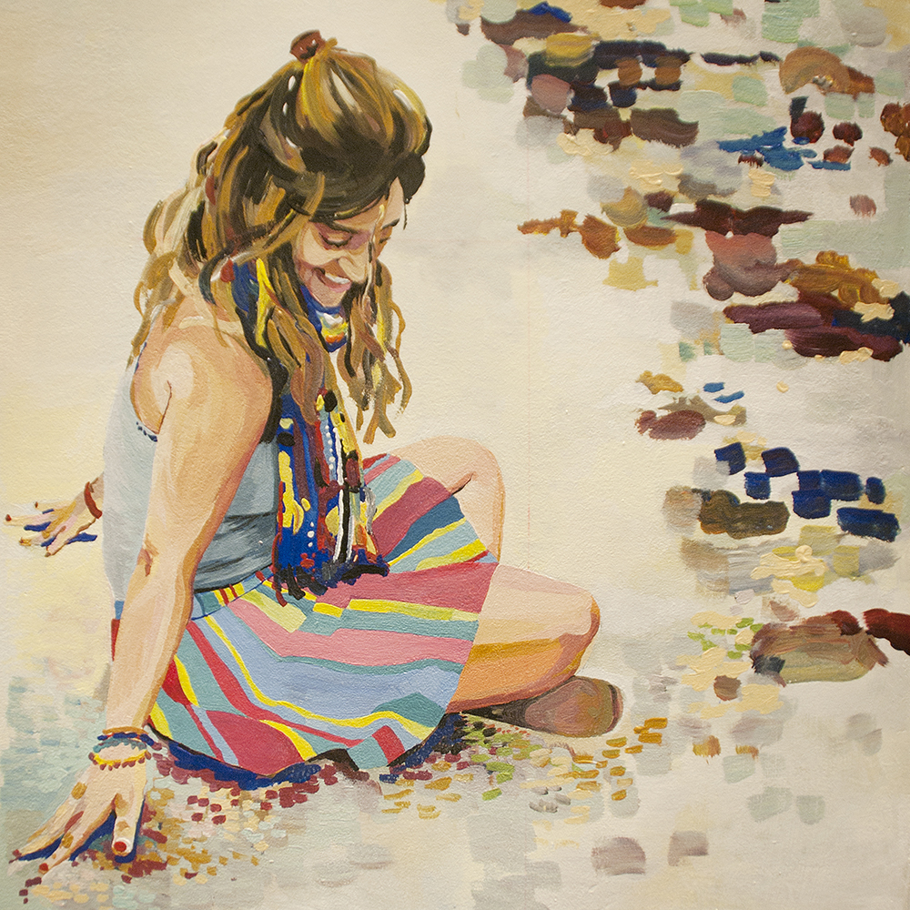
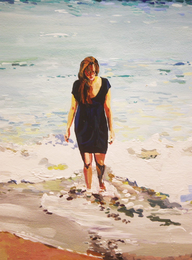
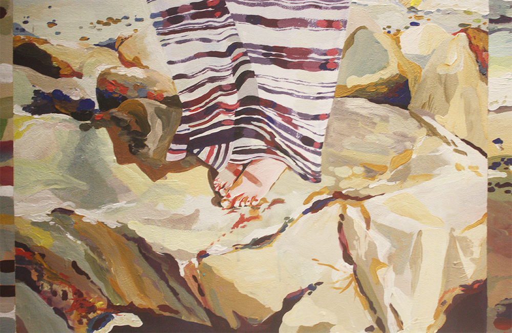
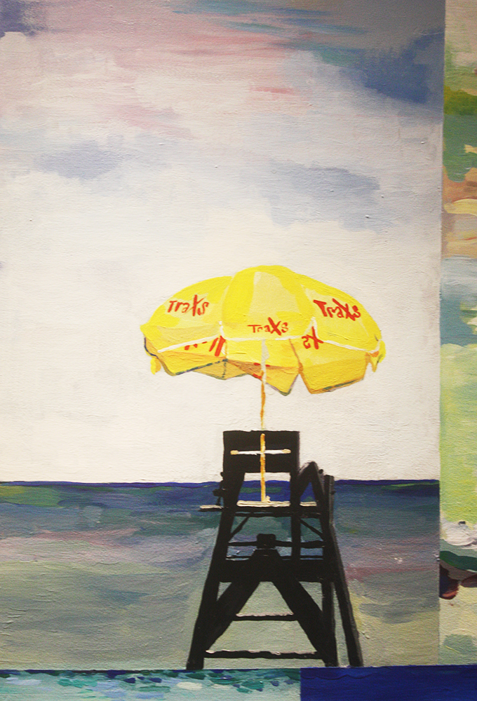
We did this mural for a building complex. The arquitect wanted to make something different on a wall in the garage entrance, so that space that is usually forgotten and dark, would be full of color and a place where . Instead of doing a continuous landscape, we decided to divide the wall in squares of different sizes and create a collage of different beach elements, people and textures. All the images were taken by us which made it extra special.
PhotoCollage made by Veronica & Elisenda.
This was the collage we started off with. We wanted to create a piece that would represent the beach and we both love photography so we started collecting pictures we'd taken in the past and we went to the beach to take some more to complete our idea and have a variety of people and objects. And we decided to be part of the story too incorporating pictures of us on the painting.
Some of the squares were 100% made by Veronica and some of them were a collaboration between the two of us.
What we thought it would be a two week project, turned out to be a month long piece. Painting a 8m x 3m wall is no joke. Every single square was a very detailed painting. We slowly started to see progress and coming together. We used beach elements, people, water and sand textures, patterns... to fill every space of the wall.
The same time we were working on the painting, the building was being finished so we were sorrounded by people, noise, dirt... We would always have people stopping by and curious about what we were doing.
We recorded some of the process and I put it together in a fast-forward video! This video is very low quality and you'll think we have severe parkinson, but it shows the progress of this complex piece!
TRADUCCIÓN:
Aún no había hablado de este proyecto que Verónica Algaba y yo hicimos hace unos cinco años en Tarragona, justo un mes antes de que yo embarcara para esta aventura en los Estados Unidos. Fue un mes intenso, la pared parecía ser más grande cada día que pasaba y hubieron momentos de mucha tensión y cansancio.
Pero no podríamos estar más orgullosas del resultado! Este fue un encargo para unos edificios nuevos en Tarragona, y el arquitecto quería algo diferente para la planta baja acceso al garage. Decidimos crear una escena de playa a base de collage de objectos, personas y texturas de playa.
Todas las fotos son de Verónica y mías y aparecemos tanto ella como yo y algunas personas conocidas nuestras.En el vídeo de arriba se puede ver el proceso de este mural de 8m x 3m.
No creo que nunca más haga un proyecto de este tipo, pero fue una gran experiencia que ni Verónica ni yo vamos a olvidar.
Personal SwatchBook
Ryan James is 27
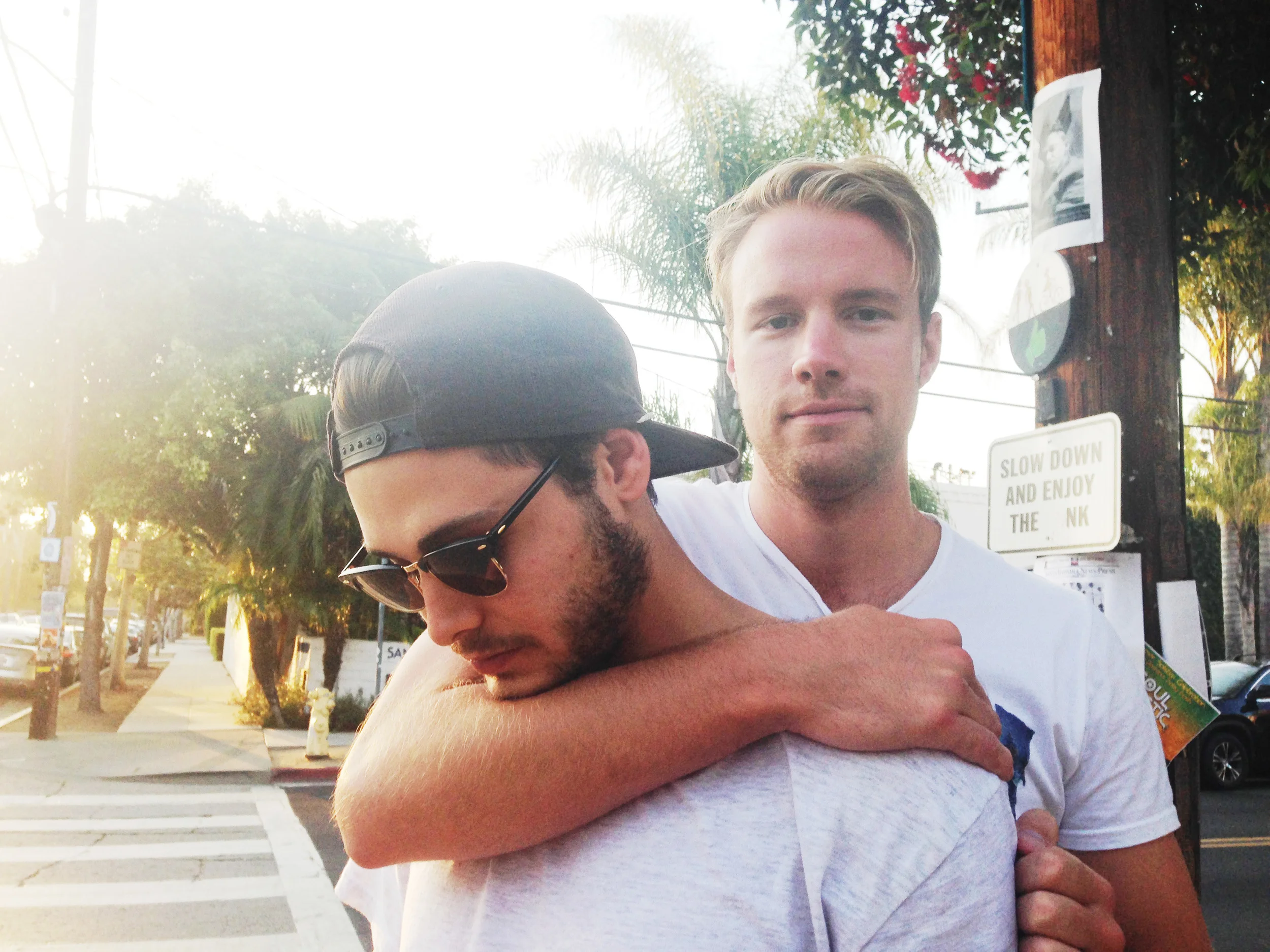
Celebrating him today!! I'm so thankful I got chosen to be his, not sure what I did to deserve it, but I'll take it!
Read More